6 May 2025
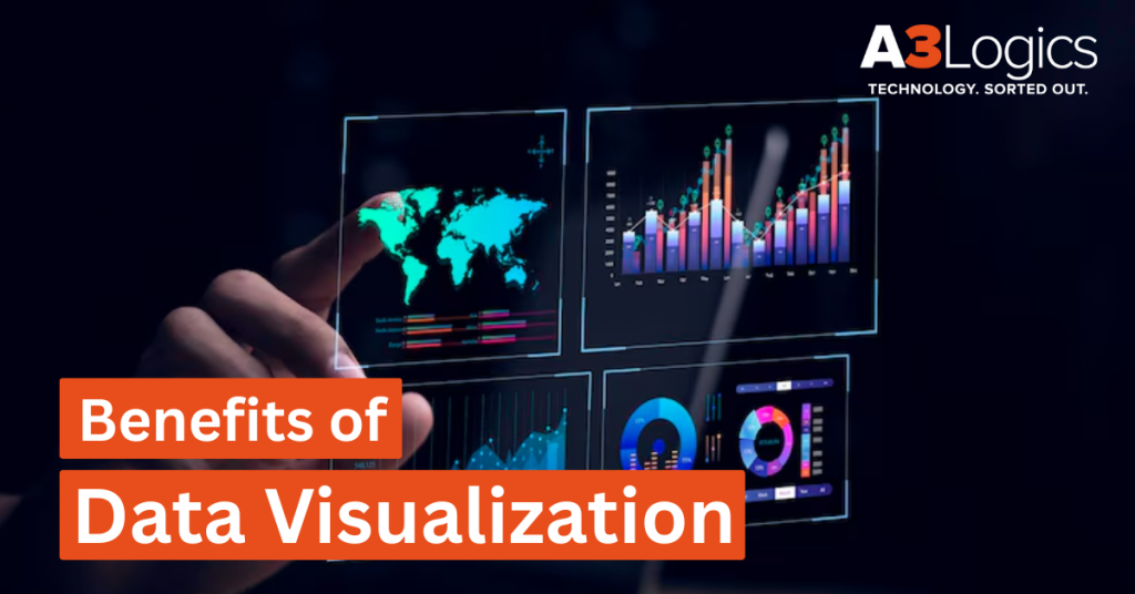
Benefits of Data Visualization: In the era of data-driven decision-making – organizations and companies are always seeking means of making effective use of the power of data. Where an average person creates 1.7 MB of data per second one of the greatest tools for making data understandable, actionable, and impactful has been the data visualization. In this blog post, we will discuss the benefits of visualizing data that cannot be overlooked, its relevance in today’s data strategy, industry-specific usage, and trendy tools that are redefining how we analyze and utilize data.
Data is being created exponentially, and companies in every industry are swimming in oceans of raw data. Raw data in and of itself, though – is not useful. Until it’s interpreted and conveyed well enough to create value. This is where the importance of data visualization fills this role. Data visualization makes numbers, percentages, and statistics into visual forms. It can be charts, graphs, and dashboards, data is easier to grasp, analyze, and take action upon.
As we head deeper into 2025, data visualization is still one of the most necessary pieces of any contemporary data plan. This article will walk you through the importance of Data Visualization, Advantages of Data Visualization and how it is transforming industries.
Table of Contents
What is Data Visualization?
Data visualization is a method of converting intricately complex data into visual forms such as charts, graphs, maps, and dashboards. The worldwide data output, storage, replication and consumption will hit approximately 147 zettabytes in 2024, and it’s forecasted to surpass 180 zettabytes by 2025. Data visualization is hence, making large and intricate datasets more accessible and understandable. Data visualization combines art and science to present data in such a way that emphasizes critical trends, patterns, and outliers, enabling viewers to perceive rapidly and correctly intricate information.
By converting raw data into comprehensible images, data visualization helps companies derive useful conclusions and make informed data-driven decisions. For instance, a line graph can automatically display trends over time, while a heatmap will show instantly high activity or usage areas without needing to sift through lengthy spreadsheets.
Importance of Data Visualization is that it is a fundamental tool for streamlining data analysis, enhancing communication, and fostering quicker, more efficient decision-making across all levels of an organization.
How It Fits Into the Modern Data Strategy
In 2025, data visualization is not an add-on tool—it’s an integral part of data strategies today. It fits well into decision-making, providing an accessible means for teams to interactively explore data.
Advantages of Data Visualization is that by allowing stakeholders to see real-time information, companies can respond to change rapidly, find opportunities, and avoid risks.
Key Formats
Some of the most popular data visualization formats are:
| Format | Description | Common Use Cases |
| Charts and Graphs | Includes pie charts, bar charts, line graphs, etc., to represent trends and comparisons. | Financial reports, trend analysis, performance comparisons |
| Dashboards | Interactive displays showing key metrics and KPIs in real time. | Executive reporting, project tracking, business intelligence |
| Heat Maps | Use color gradients to show data density or intensity over a 2D space. | Website behavior analysis, marketing campaign performance |
| Geospatial Maps | Visualize data by geographical location, such as regions or countries. | Sales territory analysis, logistics, and delivery tracking |
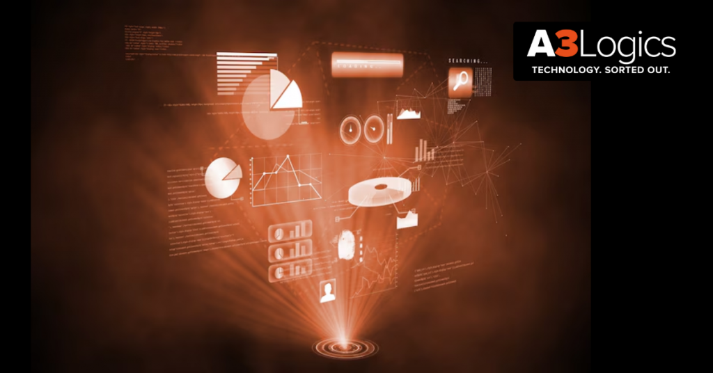
Top 11 Benefits of Data Visualization

Data visualization provides countless benefits to businesses, from making complex data easier to understand to enabling organizations to make informed decisions. Below are 11 unmissable advantages of data visualization:
1. Reduces Complex Data
Benefits of Data visualization include converting complex, cumbersome data sets into readily understandable charts, graphs, and infographics. Instead of scanning reams of columns and rows in spreadsheets, stakeholders can readily understand crucial metrics and trends. This graphical reduction closes the knowledge gap between data experts and business executives, bringing analytics to the masses and enabling actionability.
2. Exposes Latent Patterns and Trends
Trends in raw data are usually overlooked, particularly in big data. Data visualization through tools such as heatmaps, line graphs, and scatter plots facilitates the detection of correlations, seasonality, or outliers that are hard to discern otherwise. This enables organizations to detect opportunities or avoid problems far ahead of time.
3. Enables Informed Decision-Making
With the benefits of data visualization, executives are able to make decisions based on real-time insights. Visual dashboards call out performance metrics, risks, and opportunities for growth, ensuring that decisions are data-driven. This degree of transparency eliminates guesswork and facilitates confident, strategic business planning in all departments.
4. Boosts Data Retention and Audience Engagement
Images are more memorable than text or numbers in isolation. Benefits of visualizing data, include people remembering it for longer and becoming invested more deeply. In a boardroom or webinar, communicating insight with visuals ensures your message will stick and be remembered.
5. Makes Data More Accessible Across Teams
Data should not be hidden away with analysts. Through interactive dashboards and self-service BI tools, marketing, sales, operations, and HR employees can investigate and analyze data that pertains to them. This makes it easier to have a data-driven culture where each team can make decisions based on insights without relying on others.
6. Facilitates Real-Time Monitoring and Reporting
In fast-paced industries, decision-making in real time is crucial. Importance of data visualization applications interface with real-time data feeds to provide live updates on KPIs, supply chain, customer activity, and so forth. This enables companies to act ahead of problems, opportunities, or shifts in the market.
7. Identifies Areas to Improve or Intervene
Visualizations assist in easy identification of underperforming segments or operational inefficiencies. Either in the form of falling customer satisfaction, bottlenecks in sales, or delayed delivery, visually presented performance measures identify the areas that require attention, and teams can take fast and targeted action.
8. Drives Predictive Analytics
Historical information, when properly visualized, shows patterns that guide predictive models. Through visualization tools, companies are able to predict customer churn, sales expansion, or risk issues. These pieces of information guide strategic planning, budgeting, and resource allocation, enabling companies to prepare for the future.
9. Improves Data-Driven Storytelling
Numbers on a spreadsheet don’t always tell a compelling story. The importance of data visualization brings narratives to life by combining visuals with insights. Whether you’re communicating campaign ROI, product performance, or market trends, storytelling through data helps align stakeholders and drive action.
10. Improves Productivity and Workflow Efficiency
Workflows and operational data visualized allow teams to recognize redundancy, delay, or steps not required. Dashboards are able to track project progress, resource utilization, and team performance, allowing continuous improvement and streamlined operations that lead to improved time and cost effectiveness.
11. Supports Risk Identification and Management
Whatever its application is–fraud detection, predicting machinery failure, tracking cybersecurity risks–visualization is assisting in uncovering risks at the moment. Early detection of anomalies or red flags allows businesses to take steps before they need to, to expose themselves less and keep the machine running.
Industry-Specific Benefits of Data Visualization
Now that we’ve learnt about the main advantages of data visualization, let’s look at how it can help four specific industries: healthcare, logistics, insurance, and eCommerce. Let’s look at them one by one:
Healthcare
- Patient care: Data visualization enables doctors and medical professionals to track individual patients’ health records, recognize symptoms and patterns, and make informed treatment decisions. Visual representations can also assist patients better comprehend their health and progress.
- Population health management: Visualizing public health data can reveal patterns and trends in illness transmission, allowing for more effective disease control and prevention efforts.
- Medical research: Data visualization can help uncover trends in clinical trials, analyze gene behavior, and investigate other complex processes.
- Healthcare operations: Data visualization can help hospitals and health systems manage their operations, from staff scheduling to patient flow, thereby improving efficiency and patient care.
- Visualization enables hospitals and health facilities to better assess the demand for various services and allocate medical resources.
Logistics
- Data visualization enables logistics organizations to map their supply chains, identify bottlenecks, and optimize routes.
- Real-time tracking: Interactive dashboards provide live updates on cargo progress, allowing for better planning and customer service.
- Route optimization: Visualizing route and delivery data makes it easier to identify patterns and optimize routes for fuel efficiency and better delivery times.
- Risk management: Data visualization helps to identify potential hazards, such as delays or disruptions, enabling proactive management.
- Inventory management: Data visualization aids in efficient inventory management by preventing overstocking or stock outs.
Insurance
- Risk assessment: Data visualization can help insurers detect risk-related patterns and correlations, allowing them to price their products more precisely.
- Fraud detection: The display of claims data reveals trends that may suggest fraudulent conduct, allowing for early intervention.
- Customer segmentation: Data visualization enables insurers to better understand their customer base, segment it, and adjust their offerings accordingly.
- Visual data may lead process optimization, from claims processing to customer support, resulting in increased productivity and customer satisfaction.
- Policy pricing: By visualizing a variety of elements, insurers may establish more accurate and competitive policy prices.
E-commerce
- Customer behavior analysis: Another importance of Data Visualization is that assists online retailers in understanding how customers engage with their website, directing changes in user experience and conversion rates.
- Sales performance: By visualizing sales data, you may identify successful goods, seasonal trends, and other crucial insights that can help inform strategy.
- Inventory management: Visualizing inventory data allows merchants to better estimate demand, manage stock levels, and avoid overstocking and understocking.
- Marketing insights: Visualizing customer demographics, behavior, and feedback can help you develop targeted and effective marketing tactics.
- Website performance: Importance of Data Visualization emphasizes website usage trends and uncover performance concerns, hence improving the user experience.
Education
- Student Performance Tracking: Visualization allows educators to track individual student performance and highlight areas where students may require further assistance.
- Resource allocation: Data visualization can help schools and colleges determine where resources should be directed or transferred to maximize performance.
- Curriculum development: Visualizing student performance data across multiple courses might provide useful insights for curriculum improvement.
- Enrollment trends: Educational institutions can use enrollment patterns to inform strategic decisions about admissions, course offerings, and campus expansion.
- In each of these businesses, data visualization converts raw data into relevant insights that help with decision-making, strategy, and operations.
Real Estate
- Data-Driven Market Trend Analysis: Visualization of real estate market data assists investors and brokers in comprehending property value and market trends.
- Property Value and Investment Analytics: Agents employ visualizations to forecast trends in property value and make good investment choices.
- Insight into Buyer and Renter Preferences: Agents use visualization tools to monitor buyer and renter preferences to enhance sales plans.
Transportation & Logistics
- Route Optimization: Traffic, weather, and other factors are analyzed using data visualization tools by logistics firms to determine optimal delivery routes.
- Fleet Performance Tracking: Visualization of fleet data in real-time allows tracking vehicle performance, maintenance, and fuel usage.
- Real-Time Supply Chain Monitoring: Visualization of data makes it easier to manage logistics through real-time monitoring of deliveries, inventory, and supplier performance.
Most Used Data Visualization Tools in 2025
While data visualization keeps on changing, a number of tools have become the norm in the importance of data visualization:
Microsoft Power BI
Microsoft Power BI is a top business intelligence software that enables companies to see their data and communicate insights to different teams. Power BI allows users to build extremely interactive dashboards and rich reports with drag-and-drop functionality. Being integrated with other Microsoft tools such as Excel, Azure, and Teams, Power BI provides a simple add-on experience to existing Microsoft corporations.
Power BI has support for real-time data access, natural language query, and strong security features, making it accessible for both technical and non-technical individuals looking to drive decisions through data.
Tableau
Tableau is an enterprise-level data visualization tool recognized for converting data into influential, interactive graphics. It performs particularly well with data connections across diverse data sources—from spreadsheets and cloud applications to big data environments—whereby users are enabled to roam around and explore the data freely.
With drag-and-drop technology and an interface-friendly design, Tableau enables one to convert difficult data analysis without coding. It’s immensely valued for its capacity to deal with huge volumes of data and provide in-depth insights using complex features such as forecasting, clustering, and geospatial analytics.
Why Choose A3Logics for Data Visualization Solutions?
Since more and more companies are now dependent on data in order to drive their decision-making, selecting an appropriate partner in data visualization solution is a need. A3Logics presents a variety of data engineering services that are well-suited for your unique business requirements.
> Personalized Dashboard Design
A3Logics designs customized dashboards that provide real-time, actionable insights for your particular business processes. The easy-to-use interfaces enable decision-makers to track KPIs, identify trends, and respond rapidly. Every dashboard is tailored to match your business goals, providing a clearer, more efficient means of monitoring performance and strategy.
> Transparent Integration with Your Data Infrastructure
Our analytics and data visualization solutions are built to be transparently integrated with your current data infrastructure. This smooth integration causes minimal disturbance, maintaining existing workflows while strengthening analytical functions. A3Logics promises effortless onboarding so that your teams can leverage enriched insights without undergoing system overhauls.
> Scalable, Secure, and Industry-Specific Solutions
We design data solutions that grow with your business and meet industry standards and security measures. Whether you’re in healthcare, finance, or retail, our BI solutions are built to address your particular regulatory and operational needs, providing long-term performance, security, and compliance as your data and operations expand.
> Domain Experience in Facilitating Data-Driven Intelligence
With years of industry experience, A3Logics applies rich domain expertise to each project. We assist organizations in leveraging their data, discovering valuable insights, and developing a data-informed culture. Our expertise is what brings your analytics solution to produce quantifiable value and data-driven strategic decisions at each business level.
Conclusion – Benefits of Data Visualization
Data visualization is an essential tool for modern enterprises, converting complex data into an understandable visual style. It simplifies data analysis by identifying patterns, trends, and correlations that aid in strategic decision-making.
The benefits of data visualization, as discussed throughout this article, highlight its critical role in comprehending and managing the immense seas of data we navigate on a regular basis. Moving forward, incorporating sophisticated data visualization tools will be a vital requirement for maintaining a competitive edge, stimulating innovation, and navigating the complex web of informational abundance.
Thus, embracing, investing in, and expanding in the importance of data visualization is critical for identifying new opportunities and managing the complex difficulties of our increasingly linked global landscape.
Table of Contents